
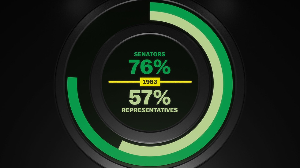
This data animation commissioned by Vox.com shows how the burdens of war are shouldered by fewer Americans than ever before. I designed a 3D environment that could accommodate and move the viewer through different types of storytelling, including charts and video, but the core feature is a visualization of 100 dots representing 100% of the U.S. population. The dots move around and transform to show how many people served in the military through history.
The data visualization as well as the overall 3D animation concept came from me, while the video elements were produced by Vox. Leading that effort was Joe Posner. The piece was produced in partnership with Veterans Coming Home, a cross-platform public media initiative made possible by the Corporation for Public Broadcasting.


The video passed 2 million views on Facebook, with around 50,000 shares, and a whole lot of comments from passionate people. It was really interesting to read the reactions from people on both sides of the political spectrum, as there are (different) reasons to worry about the divide the video describes regardless of your political affiliation.
During the creation of this piece, Joe had to go to Canada to produce an interview Vox had landed with Justin Trudeau. He trusted me to do a lot without a ton of oversight, which I really appreciated. I suspect much of the success of Vox comes down to trusting and enabling creative people to do great work. I'm grateful to them for the opportunity.
Check out the visualization page for more projects.